
Monday 15 July 2013
Monday 29 April 2013
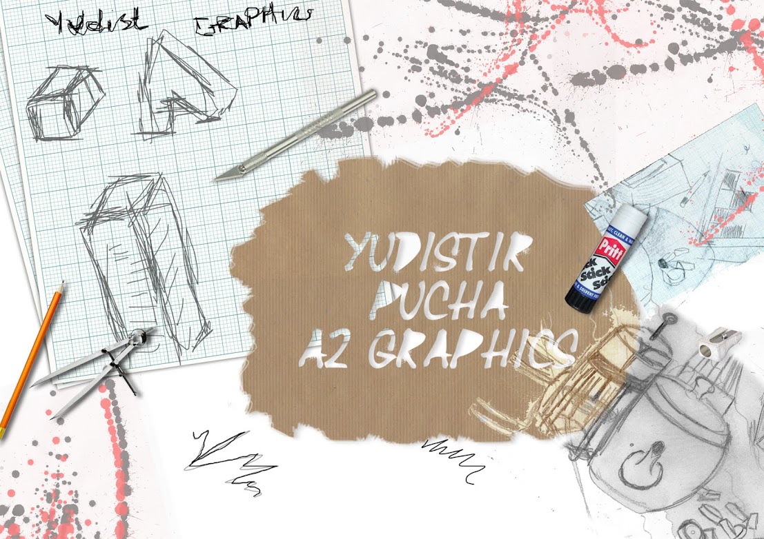
Prep. Evaluation
This journey that I have recently taken has had its ups and downs. My initial plan was to go with illustration, I wanted to do something different for my final outcome so that I wouldn't get as bored or feel like I shouldn't be doing this work or I have chosen the wrong brief for me. I chose the illustration brief so that I could express my self in a different way, something I have never tried before. So, my first idea about illustration was to hand draw what ever scenes I chose from reading the book. Little did I know, it was harder to do so. I had many practise drawing real life objects that were set in my class room. The tasks that were set were fun and enjoyable, it was there to see what you were capable of doing. Although this wasn't my field, I still tried my best to draw as much as I could and as well as I could.
After doing the observational drawing, we looked at collages, to be more precise, digital collage. This I found comfortable; using CAD software, using all my knowledge that I have of how to create certain techniques.
So for my final out comes I have decided to go with collages as I felt more comfortable doing this and I would prepare well for the exam. How this developed was a long process. At first drawing was my initial idea, then I did a Ciara Phelan inspired collage which open my eyes to the idea of having different forms or style and media to form one huge work of art, the collage. I still tried different techniques for my hand drawing illustration, so I looked at Julia Opie. So my next piece came from her.
Later, after refining and reviewing, I looked over my collage work and my hand drawn work. I found that my collage work was more interesting than my hand drawn work. This then left me to decide to go with collage for my final piece. So I started to look at different artists to get inspiration from.
Now that I decided what to do, I then chose three scenes in the book and decided to go for the cover as well . This links with the theme "Inside, Outside and In-Between"as I am doing a cover (outside) and scenes within the story (inside and in-between)
I looked at Ciara Phelan, Danny Allison, Michelle Thompson, all of these artist have helped me develop my ideas and concepts for my collage, Ciara Phelan has inspired me the most as her work stood out to me compared to the other artists. My first collage was inspired by Ciara Phelan which I think was a big deal as it "opened my eye" to the idea of collage.
Here is a work that I did

I have done many different experiments and I have gone to develop them too. I am planing to use the layering effect that I tried out at the start of this project. this will make the final piece more interesting. I will also incorporate come hand drawn images onto my final piece as well so that there is mix media rather than just one type.
In conclusion, I found this project harder compared to the other projects I previously done. The theme was a hard theme and complex. The idea of inside, outside and in-between made everything harder. On the other hand, I have improved my skills with drawing and using the application on the computer in this project. It was an enjoy experience with both challenging and easy tasks. In terms of my final outcome, I think I will be pleased as I have gone through both hand drawn and collage experiences to get the knowledge of both in my head so that I know what I can input into my collage from the hand drawing experience. So I think that my final outcome will contain most of what I have learn over the past few months.
After doing the observational drawing, we looked at collages, to be more precise, digital collage. This I found comfortable; using CAD software, using all my knowledge that I have of how to create certain techniques.
So for my final out comes I have decided to go with collages as I felt more comfortable doing this and I would prepare well for the exam. How this developed was a long process. At first drawing was my initial idea, then I did a Ciara Phelan inspired collage which open my eyes to the idea of having different forms or style and media to form one huge work of art, the collage. I still tried different techniques for my hand drawing illustration, so I looked at Julia Opie. So my next piece came from her.
Later, after refining and reviewing, I looked over my collage work and my hand drawn work. I found that my collage work was more interesting than my hand drawn work. This then left me to decide to go with collage for my final piece. So I started to look at different artists to get inspiration from.
Now that I decided what to do, I then chose three scenes in the book and decided to go for the cover as well . This links with the theme "Inside, Outside and In-Between"as I am doing a cover (outside) and scenes within the story (inside and in-between)
I looked at Ciara Phelan, Danny Allison, Michelle Thompson, all of these artist have helped me develop my ideas and concepts for my collage, Ciara Phelan has inspired me the most as her work stood out to me compared to the other artists. My first collage was inspired by Ciara Phelan which I think was a big deal as it "opened my eye" to the idea of collage.
Here is a work that I did

I very much loved the idea of having different effect for each object for example the aeroplane or the wardrobe. Although, these were not my pictures that I took,I used the internet to get these images. For my exam, I will be using my very own images and develop it my self. In a a way, her work has led to create my own version of collage with different technique. This has shown that I have been developed.
At one point I visited The Photographers Gallery in London, it didn't inspire me or my work as I wasn't to fond of their work that were displayed. Although, the collage activity was very helpful in deciding which technique would be a good idea, for example exquisite collage.I have done many different experiments and I have gone to develop them too. I am planing to use the layering effect that I tried out at the start of this project. this will make the final piece more interesting. I will also incorporate come hand drawn images onto my final piece as well so that there is mix media rather than just one type.
In conclusion, I found this project harder compared to the other projects I previously done. The theme was a hard theme and complex. The idea of inside, outside and in-between made everything harder. On the other hand, I have improved my skills with drawing and using the application on the computer in this project. It was an enjoy experience with both challenging and easy tasks. In terms of my final outcome, I think I will be pleased as I have gone through both hand drawn and collage experiences to get the knowledge of both in my head so that I know what I can input into my collage from the hand drawing experience. So I think that my final outcome will contain most of what I have learn over the past few months.
Sunday 28 April 2013


Textures

A hand drawn image of the broken table done by myself.


Friday 26 April 2013
Ciara Phelan

This work is called "Summer in the City" which was created by Ciara. It is a pull out poster as Miss Phelan has said on her website. It is for Nylon, a magazine company who asked her to do a pull out poster of various cities in the USA. Each City have their own places or areas to go to. I have chosen to analyse this piece as I have a similar idea of creating my final outcome that seems to come from this artist and her work.
Although her techniques of ding her collage are a bit different but it is similar as she cuts her work where as i will be cropping images form pictures I have taken.
Well this illustration as I have already said is a pull out poster showcasing five different cities where summer is the topic here. Ciara Phelan has said so her self on her website. Also it looks like the images that are within the college relate to the cities that are present, for example the traffic lights and sign post saying New York. Again that sign is also relative to the entire collage as it signifies journey. Quote from Ciara Phelan about this work "My illustration was designed to feel vibrant and summery whilst placing each city on a map of America and showing off its street style." I agree that she has done so to achieve this goal. This work is vibrant, the colours brings it to life. I feel like this piece falls into college with illustration. It is clear it is a college. The theme in this piece is summer, the title clearly suggests this where also the images used to form the collage is all summer related. For example a lady wearing a bikini. The reason why summer was the theme is because she was asked to "illustrate their Summer in the City guide" for Nylon magazine. There maybe other themes to this aswell like holiday, each image conveys fun and holiday. We usually associate Summer to be the fun part of the year where holidays are taken place. Lots of people travel and explore and this leads to another type of theme traveling. As this college is about illustrating five major cities, they are all spread out across the USA and to go to each state traveling occurs. The title is clear in this collage, it conveys the idea of holiday, touring. The word Summer really sums it up though. Summer can mean a lot to anyone like holidays, travel, exploring new places and many more so the title is very informative . From this title you can also tell straight away the illustration is going to be about places to go to. This work is about a guide where people can look at it and decide where to go. It is more about tourist attraction, places to visit and site see. The work is reflective to what Ciara Phelan has said she wanted to achieve a vibrant and summery style which I agree she has achieved. The deeper meaning in this I think the artist is trying to convey is; enjoy the summer as much as possible. The imagery used surely does show us about how fun the summer can be. I believe that she found inspiration from the title and also the task was handed down to her which she collaborated with Volcom.
In terms of aesthetics, the artist here has used a variety of materials and techniques. One major technique would be cropping out selected images and I believe she also does cutting outs too, so maybe there's a mixture of magazine, book images along with digital images. This adds the emphasis of mixed media into the collage, hence making it different making it come to life. Also there seems to be images that have been edited like the purple minivan, she may have added a filter or effect like noise or cutout to make it seem retro. This gives off a retro atmosphere to the collage, as it some sort of history is to be learnt to understand this. It is odd to have an old van in the middle of the collage but what the van signifies tells us a different story as those vans were very popular and people used them to travel around in. So having that image of the van is significant to the theme of travel and holiday. The process of making this is unknown but from what I have gathered, I believe that there's a bit of both handmade and computer aided design. The way the artist uses colour is very clever, the brighter colours are used with the hotter and common states on the map. For example, the green limes and oranges and strawberries are used for L.A where it is a common state for tourist to enjoy the sun where are got New York the colours used are not as bright as New York isn't that type of state compared to a beach state. Also the use of colours everywhere else make the work vibrant as Ciara Phelan has suggested. It really makes it look like it's a summer poster. Summer is about colourful images and she has used them well here for this collage. In this there are some textures added to some images like the background images, the base. There is some sort of texture added to that to make it seem vintage. This also make it work well with the other images like the van and many others. Also there are some patters scattered across the work. A blue red and green strip runs across come images but they are not very visible. Also there are come light colour shapes behind the work pieces. I think this balances out the amount of pictures with other objects.
In my opinion, I like this work in terms of techniques and materials Ciara Phelan has used to portray the image of summer. I chose to analyse this as I found it interesting to have a guide with just three states and using collage to illustrate a guide. what I dislike about this were the amount of vintage imagery used, I think that it is a bit too much it over balances out against the other images of flowers or fruits. What I like about this is the colours she has used to illustrate summer. I think she has done well to show what summer is like, colourful and "vibrant". I have not seen other works like this by different artists. It has inspired me to create my own version using my own images and editing them out to form a similar style to Ciara Phelan.
Thursday 25 April 2013


Monday 22 April 2013
Process of making a digital collage

For this collage my aim was to make the collage look old like in the WW2. I used circles and filled them in a low contrast orange this gives off an interesting mood to the collage. Also the colours works well together.
so the first thing I did was to add noise to the background to make it seem 1940. So i just simple clicked on Filter/Noise/Add Noise I then set the Amount to 20 percent.

Then I got some images of bushes and edited them by adding a filter Cutout I adjusted the levels a bit to make the bush less detailed so that it makes the image a bit older.

Here I added a layer of hand drawn animals that I found and set the layer to Overlay so that it adds texture to the collage. It also offsets the balance between the orange and cream background making it a bit different.

On this step I used a picture of a lion that I took when I went to the zoo.

After inserting the lion image, I cropped out the background and filtered the lions head by adding cutout.

Adding the tree was one off the hardest things to do as I had to crop out the tree from the background which I didn't know at first but came to know after a while of playing around. I also added cutout filter.
I also added a lamp post that I took add added the filter Artistic/ Dry brush

Adding a layer of sky with the sun and setting the opacity to around 45%.

I also added an aeroplane to signify the fact that it was WW2 this book was based on.
Subscribe to:
Posts (Atom)