Thursday 27 September 2012

Final Logo

A logo is vital element within a company or business. A logo represents the company, what the company is about. They are usually simple symbols. It's created for one purpose only, and that is to make people recognise the company or business with whatever products they are selling. For example, a very well known brand "Nike" is recognised by the iconic tick. Logos are there so that people acknowledge the company through they products they make
.

Here are similar logos that I created. one without any colour and one with blue filling.  I found making this logo to be challenging.
How I made it:
I drew a treble clef and scanned it. Then I used Adobe Illustrator to "live trace"  the scanned Treble Clef. This gave me black outline of the treble clef
Then  I used the pen tool to create the "M" beside the Treble Clef. I joined the two up into one which then lead me created the final design.
Then I opened the saved illustrator version in Adobe Illustrator and live pained the white parts with a dark blue.

What I think?
What I think of this logo is that it's simple, it is what a logo should be, a simple symbol. I think that it can be recognised by other and the design of it is elegant and sleek. It gives off a cool and relaxing atmosphere, the curves and swirls adds to that effect. 
The M stands for Mars, Bruno Mar's last name. I thought that using the" M "is more of a mystery as its not too cliche to use the last name's initial rather than the first. 

Edit of photos

Here's one of my first edit I created using Adobe Photoshop. I used the keyboard and added blur to make it seem like its unfocused  and as you get closer toward the camera then the blur decreases.
I also embossed the artist name "Bruno Mars" on the head board.
I also added some colour to make look unique.


This is an edited photo of me singing into a microphone. All I did was to fiddle around with the live trace option in Adobe Illustrator with the option colours. It gave me this effect which I think is suitable for Bruno Mars' album
it contains light colours with a balance of dark. It reflects with the songs he has


I took a picture at an angle to make it more effective and tease the audience. I then edited the image using Adobe Illustrator making the pain job dotted to make it seem like a pop art.

Wednesday 26 September 2012

Photo shooting


Primary photos are needed to create your own product. Hence I took some pictures so that I could use it for my final outcome. I think these pictures are very meaning full and they signify what Bruno Mar's music is about.
Picture 1


This is a Microphone.  The mic is useful because it signifies music.
My aim is to make a silhouette of the microphone.


Picture 2


This is a picture of me signing into the microphone, I plan to make that into a silhouette. A part of my face was taken because it makes it look like am really singing.  I will develop this image  into a photoshop stencil. For example: to the right. This was something I had created a while ago.


Picture 3
I took a picture of someone playing the guitar because it resembles Bruno Mars playing his acoustic guitar. I can develop this image by converting it to a typography poster. For example: image on the right was what I made.

Picture 4


Picture 5
A bunch of guitars sitting away unused makes it seem lonely and sad and also gives off the same mood as what Bruno Mar's songs give out.


Picture 6 
 I really like this picture i took, I hope to improve on the image more to make it stand out. It's a great scene of someone playing the piano and i thought this would be a good image to have as an album cover.


Tuesday 25 September 2012

Surface designs


Here are some wallpaper I created.
Here is a wallpaper made from one single letter that was pasted over and over to get a pattern. The letter was M in the type face "Edwardian  Script ITC". A gradient was added in the background to make it more soothing.


This is another attempt of making a wallpaper. This one is more colourful, it has the strip effect and also a reflection.


The Bokeh. I made this called the Bokeh. Its more like an unfocused image. Its colourful and bright.


This is the "Engrunged", it is a mixture of textures and grunges put together. Also, I engraved my logo into the grunges which makes it  look natural but also added colour to it e.g the red outline.


On the left is a pattern which has been contently been repeated.
It contains my final logo along side some other musical features.


Sunday 23 September 2012

Booklet experiments

 Here are some experiments making booklets.
This one is connected using tape on the edge.

two simple  fordable versions to the left.


 This booklet was stapled together. I cut out the words " Doo- Wop Hooligans" which is about my chosen album by Bruno Mars
Here is another type of booklet. This one is joined together by stitching the crease. Its secure and looks clean. Easy to create and stitch together.


Friday 21 September 2012

Gif of on Cd Package-experiment

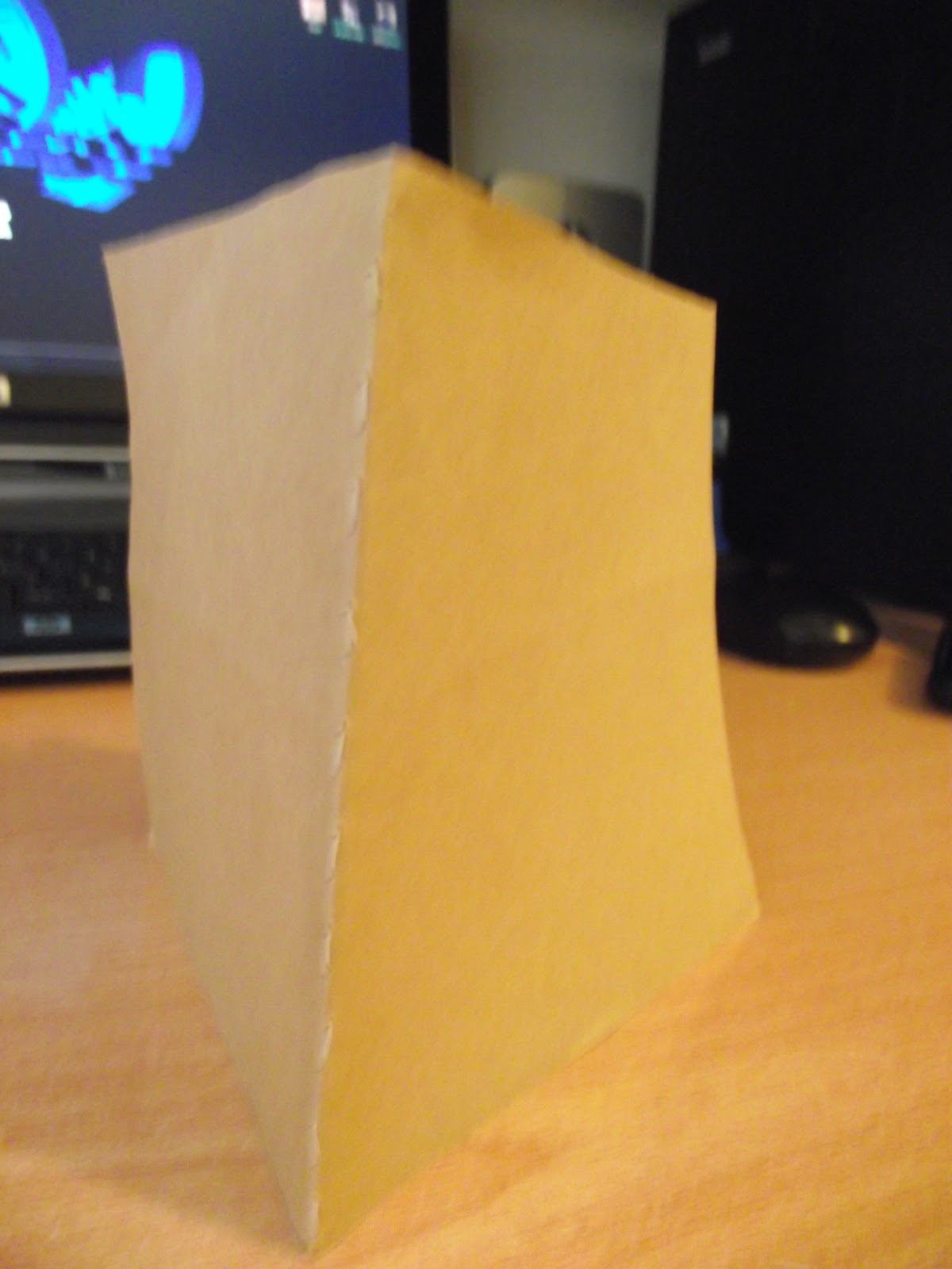
Here is a little animation showing how this type of CD package works. 

A few hand made Cd package experiment

This was made from an envelope, I used the transparent plastic an a advantage for looking through the package. Hence the CD can be shown.
Here is another package made from parcel paper. I tied the parcel paper with black string and I formed the tied string into a "K" which imitates the artist Kanye West first name initial.
This is a simple wrapping of a CD case which is sealed up with black string. It makes it seem old, how people used to wrap a parcel back in the olden days.
Here is an origami CD package. Its very simple. It's similar to an envelope. It has a safety device on the top right, once tucked in the flap wont open.

Here is one I made. Once you open it, the paper pushes the CD out revealing three quarter of the CD, i find this package more interesting because of the engineering that comes with it.
This package is made from fabric. It hangs on a black and white string.

Thursday 20 September 2012

Mood board


Here are some CD packaging which i found interesting and I would like to make some with similar quality and functions.
They are very inspirational.
This one seems like a folder.


A book with CD sized holes through out the centre of the book.