Thursday 28 June 2012

Independent CD cover

 (Blur-The Best of)
This is the "The Best of" album by Blur. The Blur is an alternative rock band formed in England back in 1988. The image on the cover consists of the band members. It has a 90s theme to it, with the shades of  yellow, blue, green and pink used. Also the type of drawing makes it seem old fashioned. The artist who created this cover is called Julian Opie  ( he is famous for his portrait drawing where he draws the human feature in a more simple way and yet still capturing what identifies that person, here is his website http://www.julianopieshop.com/julianopie.php)  his works usually goes on sale as soon as it has been made. It makes sense to use Julian Opie's artistic work for this special album as it covers "Blurs" best hits ever made, hence the album name "The Best Of". Also he may have chosen to use the four members because it's a reminder of what the band has achieved.
To the left is an album called "Belly of a Shark" by Gallows, again this is another band, although their type of music wouldn't satisfy everyone. They are a hardcore punk band.
 It is obvious now why they have chosen to use a shark and this type of art work. The work is more messy and violent like a "hardcore punk" band is. It is a dark and powerful image. The shark signifying power and hatred. The shark seems to be very big and eating a boat, this shows the violence. Also the album name "Belly of a Shark" relates clearly with what the shark is doing.  
The illustrator or artist uses swirls and wiggles to mimic the ocean. Especially the colours used, the dark purple and blue with hints of light green and blue make you feel destructive.

Screen printing

Here is an example of a screen printing. It is a mixture of merging an animal with a human via the software Photoshop.  
Below is my version of attempting to make my own screen printing using an image of Bruno Mars.
Here I tried to replicate the above image using my own image and relate it to my summer music project. 
What I like about this is the humour side of it, the giraffe has been edited to look funny, I found the giraffe to fit the image of Bruno Mars taking off his hat. 
So, I replaced the head with a funny edited giraffe to make it more amusing. 
What i don't like about this is that the head could have been similar to the body of Bruno Mars.
If i had more time, I would change the head to match with the body and also use a matching colour for the flames to suit the image.


Wednesday 27 June 2012

CD Covers x4


 This is the X&Y album by Coldplay. I find this album cover unique as the picture/image shown is weird. You aren't able to know what the image is about until you open the CD case. Within the case shows codes, and they show which code means what.  So, the cover has a code, the customer has to figure out what that code on the cover means. I then found out that it means X&Y, the album name. This is a very unique form of art work as it wants the audience to use their brains to think about what it is encrypted.

To the left is the Chemical brother's album called Push the button. straight away you can see the fist, it signifies power and in this it symbolises the brain which then makes it seem powerful. The typography here forms the shape of a human head  with the aid of the black lines. although, there are some cracks on the bricks below the hand. This can mean now power can be taken down. The entire image is self is like a rebellious action. It's more like power to the people sort of message.
This cover reminds me of Soviet propaganda posters, the political side of this is the fist and the tower it is help upon to.
Here is "The Shine's" alum, "Chutes Too Narrow". They are an indie rock and pop band. The artist Jesse LeDoux created this sleeve for "the Shins". This cover reminds me of a childish cartoon kids normally watches. The colours and drawing used conveys this message to me.  The album title comes from one of their song's lyrics, 'young pilgrim'. The whole do the album has a journey, a long worm creature travels though to every page. It is reflective of the word 'pilgrim' which is then linked to the drawing, 'young', hence the childish drawing for this album cover.

LeDoux used die cutting to make this album. Within the album, lyrics of the songs are given and also the listing are found along side.

Vector Image


An example of a vector image created by Miles Donovan Artwork.
This is my attempt of creating my own vector image of Bruno Mars. I find it to be a good turn out, the details are very clear, you are able to see the outlines and identify what makes this image detailed. I used the softwares Photoshop and Illustrator  to turn the original image into this vector image.
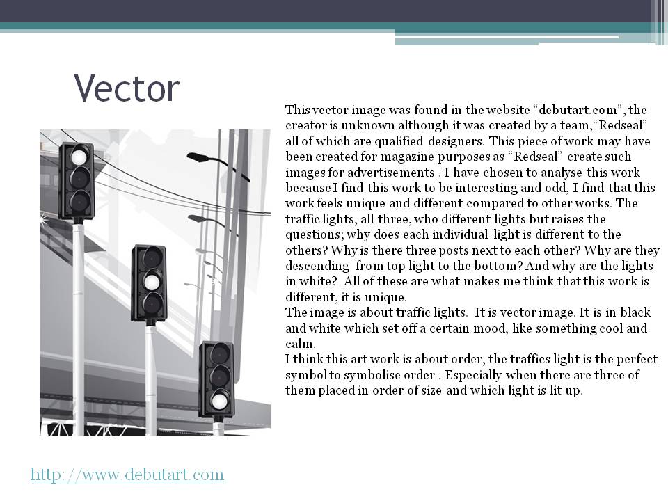
What went well?
The outline of the body went well and also the colours used works well with each other.
what could I improve?
If i hade more time, I put in more details on the face for example the nose and the ears. It would improve the image by huge amount.


Monday 25 June 2012

Photoshop Collage from Bruno Mars stencil

This an experiment on using the stencil i created earlier then editing it using photoshop.Andy Warhol inspired me to create this art work as he has done a similar art piece to this with the famous Marilyn Monroe.First, I made the original image (top left) as a brush preset. Then I stamped it into an ordered pattern using different colours to give off a colourful image.


Beck-Information

Beck is a well known band. Their music is usually alternative hip pop and rock.
This is their album, "Information".
It is a self made CD cover where the owner creates their own art work with the graph paper provided with the stickers given.

 When I first look at this CD cover, I feel that it is to simple and boring and seems cheap. Although it seems unique. I have not seen such CD cover before. It's rare to find such CD covers. This is why it makes the album stand out which i think is the aim from the artist. Also, the stickers provided are unusual, the images picture you wouldn't expect.

Sunday 24 June 2012

Rob Ryan inspired Cd cover

This is a Rob Ryan inspired CD cover for Bruno Mar's new album "Do Wop Hooligans". I made the cover simple.

what i like about this is the flowing lines that's around the cover, it is simple but effective, it's links with the music that Bruno Mars creates, calm, free flow and simple but inspirational. Also the heart (bottom left) also links with his songs, it's mostly about love.

What i don't like about this paper used, it's not an attractive colour also, the lines aren't accurate, so if i had more time, i would perfect the lines and the cutting outs.

Thursday 21 June 2012

stitching

This an example of using stitching as a CD cover. To the left is a band called PUPL and their cover shows a silhouette of the band with different fabric patterns embedded in them.


Now this is my attempt of making my own stitching style CD cover.I used a silhouette of my self to make the body shape. Then I put a mask of a pattern.
What I like about this is the button typography, it makes it more realistic.
If I had more time, i would have a better pose and better patterns to use.

Monday 18 June 2012

My own...Billie Jean

This is my own hand drawn image using a Biro pen. I was set a task to make my own Billie Jean drawing related to the summer music project. The image on the left is what I came up with.

In this I used images and items that are related to music, hence the reason why a keyboard is the main item. There are a number of 'doodles' that are self reflecting, for example the swirls represents the free flows of music.

The image is also messy, this adds characteristics to the image, it makes the more valuable.

What I like about this is the items that is surrounded around the keyboard. It makes the makes the image more personal.

what I don't like about this is that the drawing doesn't contain more image that are related to music.

if i had more time, i would have added more images in the background.

Typography Portrait... Guess Who ?

This another portrait of a famous musician. It is a poster for the 51st Grammy Awards. 
This is a typography portrait of Bruno Mars. I used a tutorial from youtube to create this portrait. It is linked to my summer music project.  I used photoshop to make this portrait. The words used are lyrics from his song
What i like?
what I like about this is the colours used, it is bright and it shows the summer theme.  The yellow seems like the sun on the top left.
What i don't like?
what i don't like about this is that you are unable to see the facial features which then makes it hard to recognise who the artist is.
If I had more time, I would use another image of Bruno Mars, one that is more clear and has a plain background.


Sunday 17 June 2012

Billie Jean.NikeVandal Ad.

This is an ad. created by Billie Jean who is a very famous illustrator. It is a hand drawn image and the artist used a Biro pen to do so. This ad. is about celebrating 30 years of basketball shoes by Nike. This poster, assuming was, perhaps used around urban areas.This is because of the shoe it self, but also the content of what is drawn on the poster. The shoe it self was targeted for the urban community, young and fashionable people such as teenagers. You are able to tell by the objects Billie Jean has drawn around the shoe. The doodles such as the swirls and random images reminds us of how teenagers draw out of boredom. Hence this image is suitable for young people who like to wear fashionable items.
There are a number of drawing that relate to the sport, basketball, the main item that appears most is the basketball it self. Quite a few are found scattered around the show. It emphasises the topic that is brought forward, celebrating 30 years of basketball shoes.
     The fact that Billie Jean did this piece of work by using a Biro pen makes the drawing more valuable. The illustrator has used such techniques as shading to give the shoe a more realistic approach. It roughens the shoe up like it would have been in real life.
  As it is shown,the year1985 is written under the word "Vandal", we can successfully assume that this type of Nike shoe is called Vandal.  The word "Vandal" has one main meaning, the destruction of something good which then relates to Vandalism. So, by giving this shoe the name Vandal, it sets up its own characteristics, it shows toughness and messy and urban. The drawing then summaries the shoe. The doodles around the shoe represents the vandalised area of the beautiful shoe.

Thursday 14 June 2012

Stencil of Bruno Mars


The first step. This is the stencil created in photoshop.
I then printed out the image on card and cut out the black area.
Then i used a sponge and dipped it in green acrylic paint and lightly dabbed on the cut out.

Bruno Mars photoshop stencil

Photoshop Stencil of Bruno Mars
Here is my attempt of making a Photoshop stencil of a famous musician called Bruno Mars. This is linked to my upcoming project about summer music.I chose him because of this wondrous hits he has achieved.