Tuesday, 19 February 2013
Personal Analysis- Danny Allison
The image on the left was created by a well known illustrator, Danny Allison. Danny Allison has a diploma in photography where he studied at Blackpool college as he was born and raised there, after trying out becoming a professional skateboarder. From then he took on this course, he doesn't regret any of this decision but pleased with what has happened. As he said, if it wasn't for the skateboarding, he wouldn't be an illustrator. His past "heavily" influences his illustration style and creative process.
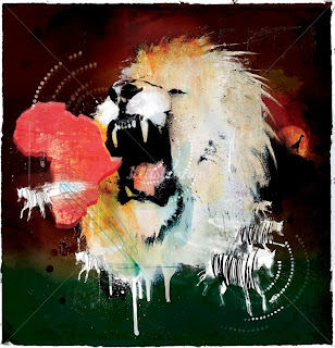
Now, the image on the left is an illustration of a lion and where they are from. The time of which this was made is unknown to us. I also assume that this work was for exhibition purpose so to admire his works. The reason why I chose to analyse this piece of work is because of the style that Allison uses to convey the lion and I also like the uses of different colours and textures that appear on this work.
There wasn't much information to be found with this work. The illustrator didn't write anything about this on his website.http://dannyallison.co.uk/editorial-1/ . Although I would associate this work to be printing as it seems like most of the objects were printed on to paper for example the zebras or the continent Africa. Moreover there may be a hint of painting of some sort as there are strokes to act as the lions mane; which i think suites the lion and to signify wild. Also the way the lions has opened his mouth seems like he is about to roar which adds move emphasis on the painting technique used. Also there are other techniques to explore int his work. For example the zebras' stripes are drawn in a messy manner. I get the sense that this work links with how the wild or how they behave. The theme within this picture is animals, the wild life. There are strong evidence to support this as there are different animal within in image. For example the giraffe against the sun set. Also the theme of power comes to mind, the lion symbolies power as it is the "king of the animals". The story behind this I believe is about power, the lion dominates all animals hence the zebras running away. The roar of the lion emphasise on the power the animal. Also the fact that the lion in portrayed to be big, it is the biggest image on the work. Again power takes over with this piece.
The materials that Allison used I think were colour paints and sprays and some sort of pressing devices to make the prints.Also brushes. You can tell he has used these materials to make this withing the work. For example the brush strokes or the dripping paint. The techniques used for this work is mostly hand crafted. Like the printings of Africa or the zebras. The colours used for this relate to each other, like the green gives the effect of the ground and also wildlife. The colours used for the lion's mane is interesting, you would expect it to be covered in brown but Danny Allison I think was trying a different approach to what people would expect, he blends to white and a light brown orange colour to make the lion stand out even more from the dark colours in the background. It again makes a draft like outcome which suites the work very much compared to creating a neat drawing/painting of the lion and zebras wouldn't look as good as this one. It would just be boring and dull, almost pointless.
In conclusion, I chose to look at this work because I found the use of different techniques within this work very interesting and that they all compliments each other. My first response to work was that I found the colours intriguing, the way Allison has mixed the colours making it look like a rough painting which gives off wild and lively atmosphere . What I do not like about this work are the little scribblings in some parts of the piece, to me it feels like it's pointless. For example the green scribble just below the lion. It's not very attractive and that it looks very random. I think it take away some of the work's value in terms of quality. I have not seen may works that have a style like Danny Allison, his work is very different, although where are some common techniques used in this work like the mane is created from brush strokes.
This work has inspired me as the illustrator has used many different techniques the illustrate uses for example using prints and brush strokes.
Subscribe to:
Post Comments (Atom)


No comments:
Post a Comment