
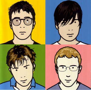
This art work is now shown in the National Portraits Gallery where any is able to see this work of his. To make this, he used a computer. The process is unknown but I assume that he may have used CAD software and selected areas e.g. the hair then filling it with the a tone of colours selected from the original picture. I this may be linked to pop art due to the colours used although they are not bright colours but light and calm. It has a slight resemblance to another piece of album cover by the Queens called Hot Space. He has said that "I often feel that trying to make something realistic is the one criteria I can feel fairly sure of. Another one I sometimes use is, would I like to have it in my room? And I occasionally use the idea, if God allowed you to show Him one to judge you by, would this really be it?" He uses these questions to inspire his art work, to make his art work to look as it looks.
I can also assume that each colour behind each band member represents their personality. For example the yellow symbolizes peace and calmness.
Speaking in terms of techniques Julian Opie may have used to create this would most likely to be computer aided design. Like his other work, they are mostly computer generated. What interest me the most is the thing black lines that shape up each of the members. The simplicity of the way each member is created makes it look even more vibrant. Rather than having little details to imitate the realistic object, the simple lines do just fine. Moreover, the colours he used to illustrate each member really make the work even more attractive. It makes it unique, something different to what you usually expect especially for an album cover.
I have chosen to look at this work because I find the simpler the drawing, the better the story. I think that is what's happening here, It is very simple to do. I would like to base my work on this factor, simple. When I first saw this, i didn't like it as much as it was just plain but after a while it stuck with me of how the simplest thing can be the most illustrative images. I believe this image is doing so. This work reminds me of Andy Warhols' work, although there is a slight resemblance in layout.
No comments:
Post a Comment